
Beyond the Dashboard | Principle 7: Build Layered Dashboards to Scale Thinking
One-size dashboards are a myth. Build three layers: Outcome for execs (telescope), Driver for teams (levers), Deep Dive for analysts (microscope). AI enriches layers, it doesn’t flatten them. The aim isn’t more charts; it’s scaling clear decisions at the right altitude. Make layers reduce noise. Go!


TL;DR (For Those Who Have a Board Meeting in Ten Minutes)
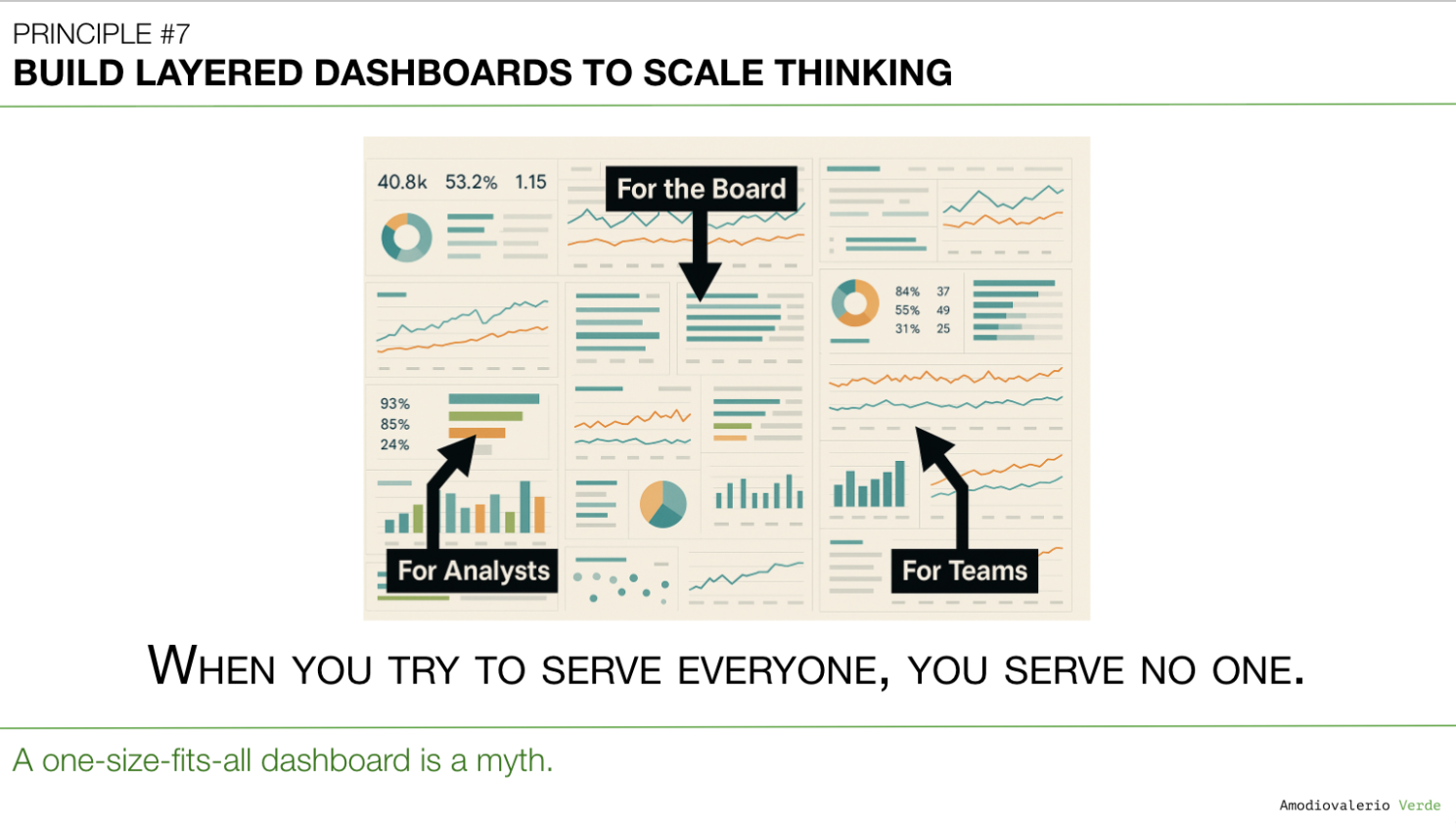
- One-size-fits-all dashboards are a myth. Trying to serve executives, team leads, and analysts with a single view creates noise for everyone and clarity for no one.
- Build in three layers: Structure your reporting to match how decisions are made. The Outcome Layer for executives (telescope), the Driver Layer for product teams (levers), and the Deep Dive Layer for analysts (microscope).
- AI enriches layers, it doesn’t flatten them. Use AI to summarize deep-dive data for the outcome layer or to flag anomalies in the driver layer. But without clean, structured layers, AI just automates the confusion.
- Your goal is to scale thinking, not just reporting. A good dashboard system provides the right altitude of information to the right person, enabling better, faster decisions at every level.
A Quick Recap: The Tower of Partial Truths
In Principle 6: Know Your Tool Stack’s Boundaries, we established a hard truth: you don’t have a single tool for every truth, you have a stack of partial truths. Your CRM, BI tool, and product analytics each hold a specialized, incomplete view of reality.
The impulse is to try and force these partial truths into one grand, unified dashboard. This never works. It creates Franken-metrics and erodes trust. The solution isn’t consolidation; it’s orchestration.
But that leads to the next critical failure point: even if you have clear, federated sources of authority, how do you present that information? Who gets to see what? Trying to show everything to everyone is just as dangerous as merging everything into one flawed number. This is where most reporting systems fail.
The One-Size-Fits-All T-Shirt
A one-size-fits-all dashboard is a myth. It's like a one-size-fits-all t-shirt: it technically fits everyone but looks good on no one.
You’ve been in that meeting. The one where a dense dashboard with fifty metrics and twenty charts is projected on the screen. The team lead thinks it demonstrates thoroughness. The executives just see noise. They can’t find the one number that answers their only question: "Are we winning?"
This isn’t a design problem. It’s a failure to recognize that to make decisions.
- Executives need a telescope. They need to see the destination and know if they’re on course.
- Team leads need levers. They need to see the inputs that are driving the executive-level outcomes.
- Analysts need a microscope. They need to get into the raw data to diagnose why the levers are moving.
When you blend all three views into one, you create a dashboard that’s too detailed for the board and too high-level for the analyst. You’ve successfully built a tool that is useless for everyone. This is not creating alignment; it’s scaling confusion.
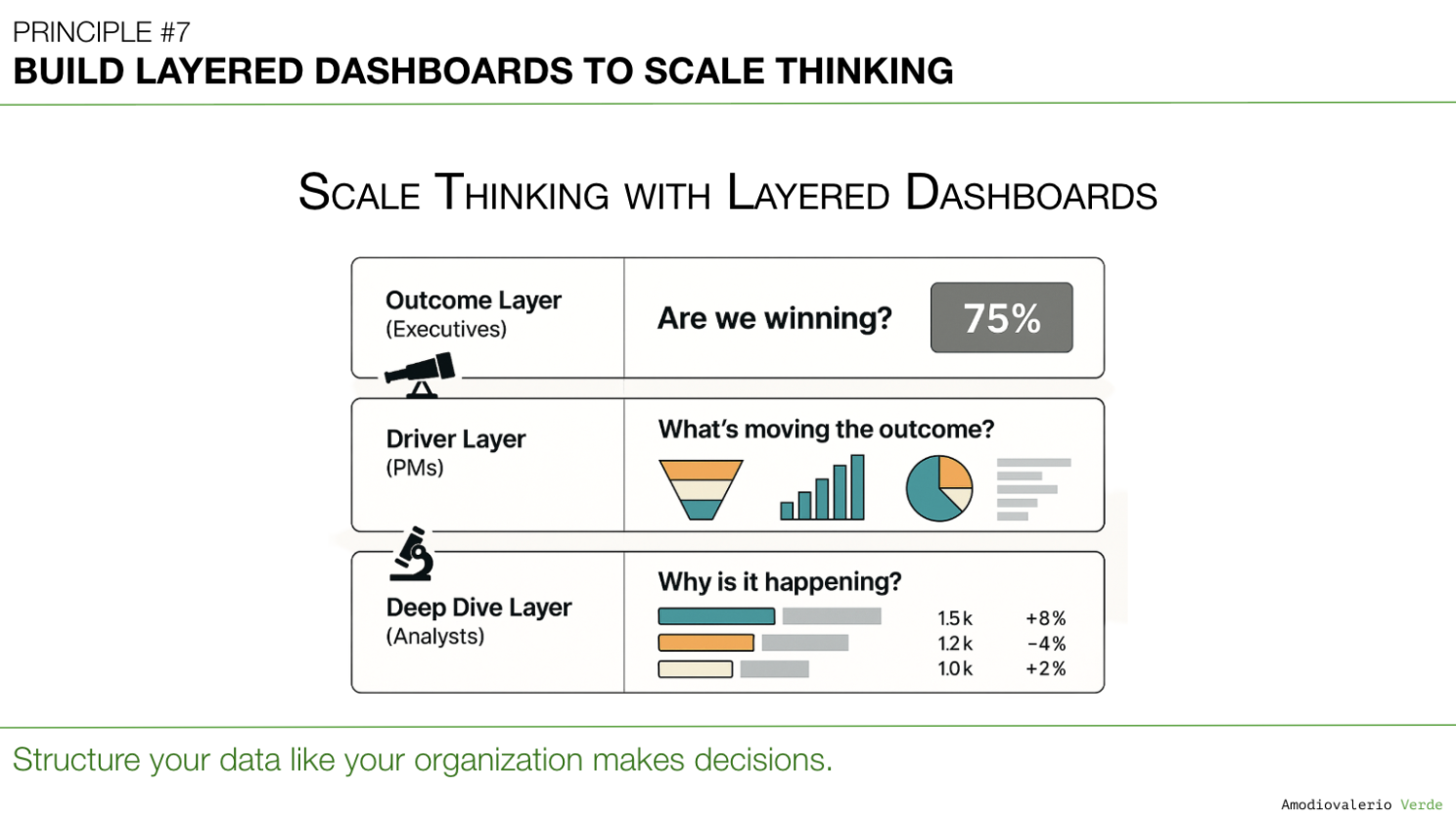
The Solution: A Three-Layer Architecture for Thinking
Instead of a single, monolithic dashboard, strong organizations build their reporting in intentional layers. This isn’t about creating more dashboards; it’s about creating the right dashboards, each designed for a specific job.
Layer 1: The Outcome Layer (The Telescope)
- Audience: Executives, the Board, C-Suite.
- The Question It Answers: "Are we winning or losing?"
- What It Shows: One, maybe two, headline metrics that represent overall business health. Think Net Revenue Retention, Total Active Accounts, or a unified Customer Health Index.
- Purpose: This layer is for a 30-second assessment of performance. There is no drill-down. It’s a statement, not a conversation.
Layer 2: The Driver Layer (The Levers)
- Audience: Product Leadership, Team Leads, GTM Leaders.
- The Question It Answers: "Why are we winning or losing?"
- What It Shows: The 3-5 key input metrics that directly influence the Layer 1 outcome. If the outcome is Active Accounts, the drivers are metrics like New User Activation Rate, Usage Frequency of core features, and Account Churn Rate.
- Purpose: This is the dashboard where strategy is debated and resources are allocated.
Layer 3: The Deep Dive Layer (The Microscope)
- Audience: Product Managers, Analysts, Engineers, Designers.
- The Question It Answers: "Where exactly is the problem or opportunity?"
- What It Shows: Flexible, granular views of the data.
- Purpose: This layer allows for segmentation by user, region, feature, or any other relevant dimension. It’s a workspace for investigation, not a report for presentation.
This layered system ensures that every conversation happens at the right altitude. The board stays focused on strategy, and the team is empowered to diagnose and act.
AI’s Role: Enriching the Layers, Not Blurring Them
AI is a powerful partner in a layered system, but only if the layers are clean and well-defined first. Used correctly, AI can act as the connective tissue between the layers.
- For Layer 1: AI can generate automated natural-language summaries of Layer 2 drivers, giving executives a concise narrative of why the outcome metric moved.
- For Layer 2: AI can monitor the driver metrics for anomalies, flagging a sudden dip in Usage Frequency before it impacts the top-line outcome.
- For Layer 3: AI can accelerate deep dives by clustering user feedback or surfacing correlations in raw data that a human analyst might miss.
But be warned: if your layers are messy, or if the metrics are poorly defined, AI won’t fix it. It will just automate the confusion, generating confident-sounding summaries based on meaningless inputs.
Reality Check: Is Your Dashboard a Tool or a Decoration?
It’s time to be honest about your own dashboards. Ask yourself and your teams these questions:
- Can our executives understand the state of the business from our dashboard in 30 seconds or less?
- Can our product teams use the dashboard to explore the "why" behind a metric change without needing to request a custom export?
- Can our analysts dive deep into the underlying data without having to rebuild everything from scratch?
If the answer to any of these is "no," your dashboards are likely decorative, not diagnostic. They exist to be presented, not to be used for decision-making.
Final Thought
Your organization doesn’t need more charts. It needs more clarity. A one-size-fits-all dashboard is an act of intellectual laziness; it signals that you haven’t done the hard work of deciding what matters to whom.
Building layered dashboards isn’t about adding process. It’s about designing a system that respects how people think and decide. It scales clarity by delivering the right information to the right audience at the right time.
Stop building dashboards that try to be everything to everyone. Start building a system that helps everyone think better.
What’s Next?
Now that we have a system for presenting data to different audiences, a new problem emerges, especially in larger companies. How do you apply this logic when you’re not managing one product, but a portfolio of many? The temptation to roll everything up into a single, blended dashboard is immense and a trap.
That will bring us to Principle 8: Manage Multi-Product Portfolios Separately.
See you there!
PAQs – Potentially Asked Questions
Isn't creating and maintaining three layers of dashboards significantly more work for our data teams?
It’s not more work; it’s different work, and it's higher leverage. Your data teams are likely already spending countless hours building one-off reports and custom views because your monolithic dashboard fails to answer specific questions. A layered system replaces that reactive, low-value work with proactive, high-value system design. You invest the time once to build a clear, scalable structure, which then saves hundreds of hours of future "dashboard debate" and ad-hoc analysis.
How do you prevent these layers from becoming disconnected silos?
The layers are a hierarchy of explanation, not isolated reports. The connections must be explicit and maintained. The metrics in Layer 2 (Drivers) must be mathematically proven drivers of the metric in Layer 1 (Outcome). When a Layer 1 metric moves, the narrative in the executive review should come directly from the analysis of Layer 2. The layers aren't silos; they are the drill-down path that connects high-level strategy to on-the-ground execution.
My executives say they want all the details. How do I convince them they only need the Layer 1 "telescope" view?
You show, don't just tell. Present them with both views in the same meeting. First, show the cluttered, all-in-one dashboard and ask them to make a decision. Then, present the clean, Layer 1 dashboard with a one-sentence summary of the Layer 2 drivers. The relief in the room will be palpable. Executives don’t actually want the details; they want the confidence that someone is managing the details. A layered system provides that confidence by showing that a rigorous, logical structure exists beneath the surface.
We are a small startup; does this layered approach still apply?
Absolutely. The principles are scale-agnostic. In a startup, the "layers" might all live in a single spreadsheet, but the mental model is the same. The CEO looks at the top-line outcome (e.g., Weekly Active Users). The product lead looks at the drivers (sign-ups, activation rate, churn). And when a number moves, the whole team dives into the granular data. Establishing this discipline early prevents the chaos and "dashboard-as-wallpaper" culture that cripples so many companies as they scale.
Where exactly does AI fit into building and maintaining these layers?
AI is the accelerator, not the architect. Its ideal role is to automate the flow of information between the layers. For example:
- Automated Roll-ups: An AI agent can be tasked to monitor Layer 3 data and generate a weekly summary of key anomalies or pattern shifts for the Layer 2 review.
- Narrative Generation: AI can take the key changes in Layer 2 driver metrics and draft the executive summary for the Layer 1 report, flagging the "so what" for leadership.
- Diagnostic Assistance: When a Layer 2 metric dips, a PM can use an AI assistant to quickly query Layer 3 data, asking questions like, "What were the common behaviors of users who churned last week?" to speed up the diagnostic process.
Intro: Beyond the Dashboard Series
Principle 1: Avoid the Data Delusion
Principle 2: Adopt a Data-Informed Approach
Principle 3: Choose What to Measure
Principle 4: Use Frameworks as Filters, Not Blueprints
Principle 5: Focus on Adoption, Not Just Delivery
Principle 6: Know Your Tool Stack’s Boundaries
Principle 7: Build Layered Dashboards to Scale Thinking
Principle 8: Manage Multi-Product Portfolios Separately
Principle 9: Reconcile Metric Definitions Before Analysis
Principle 10: Build Thinking Systems, Not Reporting Systems
Principle 11: Turn AI into a Judgment Multiplier