
Beyond the Dashboard | Principle 8: Manage Multi-Product Portfolios Separately
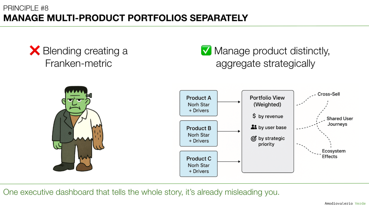
Blended portfolio metrics become Franken-metrics: pretty roll-ups that mask product realities. Treat each product as its own system with distinct health and leading signals. Synthesize across products instead of averaging. AI clarifies only when signals stay separate. Or it polishes the camouflage.


TL;DR (for the impatient but curious)
- In many enterprise SaaS portfolios, blended metrics across multiple products create what I call Franken-metrics: stitched together, hard to interpret, and rarely actionable.
- Managing a suite of products with a single metric set is like trying to steer a fleet of ships using one compass.
- AI can make the problem worse by creating beautifully wrong roll-ups, or better if you feed it the right distinctions.
- Treat each product as its own system: with separate health metrics, adoption curves, and decision logic.
- Portfolio-level clarity comes from synthesis, not aggregation.
A Quick Recap: Where We Left Off
In Principle 7: Build Layered Dashboards to Scale Thinking, we established that a one-size-fits-all dashboard is a myth that serves no one. The solution is to create intentional layers of information: a "telescope" for executives, "levers" for team leads, and a "microscope" for analysts . This layered system provides clarity by delivering the right altitude of information to the right audience for a single product.
But that leads to the next critical failure point. What happens when your challenge isn't just vertical complexity, but horizontal complexity? How do you apply this logic when you’re not managing one product, but an entire portfolio of them?
The impulse to roll everything up into one beautiful, aggregated portfolio dashboard is immense. It is also a trap that creates strategic blindness. This brings us to a crucial rule for managing complexity at scale.
When Everything Looks Green
Picture this: You’re in a quarterly business review. The portfolio dashboard is up on the big screen. Everything’s green. Adoption is trending up, revenue targets are on track, churn is within limits.
You exhale. Things look good.
A green portfolio dashboard can sometimes give the impression that everything is healthy. Yet, at the product level, different realities may be unfolding with some products thriving, others struggling. Without a way to surface these nuances, leaders risk missing critical early signals.
This is a common challenge in multi-product portfolios. Aggregated views can create comfort at the top but reduce the clarity needed for product-level decisions.
The goal isn’t to discard portfolio-level views because they are essential for executive alignment. The key is to complement them with product-level clarity, ensuring no important signal gets averaged away.
Note on Context and Nuance
The perspectives shared here reflect broad lessons from SaaS portfolio management and are not tied to any single organization. In some contexts, particularly in large enterprises, aggregation can be a deliberate and effective strategic choice used to simplify executive alignment, highlight overarching trends, or maintain focus on top priorities. The intent of this principle is not to suggest that blended metrics are always harmful, but to encourage leaders to apply them consciously and with awareness of the trade-offs. The key is intentionality: aggregation should be a choice made for clarity and alignment, not a default that risks obscuring important product-level signals.
The Franken-Metric Problem
When you blend metrics across multiple products, you don’t get truth. Instead you get camouflage.
- Adoption: A star performer hides the struggles of a lagging product.
- Revenue: A strong upsell pipeline masks a declining renewal rate.
- Engagement: A spike in one app buries stagnation in another.
It’s like averaging the health of a family: if one person has a fever of 41°C and the other two are perfectly fine, the average temperature looks “normal.” But one person is in serious trouble.
Blended metrics often risk creating strategic blind spots, though in some contexts leaders may deliberately choose aggregation for simplicity or alignment.
Franken-metrics often look compelling in executive reviews. The real challenge for any leadership team is to ask the uncomfortable but essential questions:
- “Which product carried this number?”
- “What’s hiding behind that average?”
- “Are we winning overall, or just in one corner while the rest are bleeding out?”
And so we nod, congratulate ourselves, and we walk straight into strategic blindness.
Why This Happens
This trap can surface in many large, complex portfolios, especially where leaders seek simplicity at scale. These forces drive it:
- Portfolio Pressure: Leaders often seek a simple, unified story, a neat slide with arrows going up. Yet simplicity at the top can unintentionally create distortion at the bottom.
- Shared OKRs: When goals are defined at the portfolio level without nuance, teams optimize for the metric instead of the product reality. If “total DAU” is the target, everyone pushes for logins, even if value delivered per product is wildly uneven.
- Tool Limitations Analytics stacks often roll up numbers by default. That cohort churn dashboard? It’s aggregating across products unless you explicitly slice. Your BI tool wasn’t designed to scream: “Stop blending apples and oranges.”
- AI Hype Ironically, the more sophisticated our analytics become, the more tempting it is to produce single, impressive-looking charts that bury nuance in layers of machine learning-powered smoothing.
The AI Twist: Firehose or Filter?
Here’s the paradox: AI can either be your best ally in managing portfolios or your most dangerous enabler of delusion.
- The Danger: AI loves large data sets. Feed it blended metrics, and it will happily spit out forecasts, churn predictions, and customer segmentation models… all built on poisoned averages. You risk getting precise-looking outputs that mask underlying realities.
- The Opportunity: Used intentionally, AI can surface anomalies within a portfolio instead of masking them. It can: Flag outlier adoption curves across products. Cluster support tickets by product to highlight where pain is concentrated. Simulate “what if” scenarios for each product line, showing how a lagging product drags portfolio revenue over time.
Think of AI as an X-ray: it can show you where the fractures are, but only if you tell it which bones to look at. Without boundaries, it just prints you a full-body average and calls it healthy.
The Strategic Cost of Blended Portfolios
The cost of relying solely on blended metrics often only becomes visible later. Leaders who adopt a more granular, product-level approach gain earlier signals and can allocate resources with greater precision.
- False Confidence You celebrate success at the portfolio level while neglecting underperforming products that quietly erode trust and renewal rates.
- Misallocated Investment Resources flow to the "average" instead of the urgent. Your A-player product gets more budget it doesn’t need, while your struggling product starves.
- Blind Risk Accumulation Blended metrics can delay the recognition of a product in decline sometimes until it’s a full-blown crisis. By then, clawing back adoption or trust is exponentially harder.
- Team Demotivation Product teams working on lagging products feel invisible. Their challenges are smoothed over in executive dashboards. Nothing kills motivation faster than knowing your pain points are averaged away.
In very large and complex portfolios, some level of aggregation is not only inevitable but useful. A synthesized portfolio view provides essential orientation for executives and stakeholders who cannot absorb the full detail of every product line. The key is to treat that top‑level view as a starting point, not the full story. Behind every “green” slide, leaders must have access to product‑specific dashboards that expose the uneven realities. As usual, there is no one‑size‑fits‑all. Aggregation is fine at the top, as long as it is layered with detail underneath and never used as the sole basis for decisions.
How to Break the Franken-Metric Habit
If blended portfolio dashboards create more delusion than clarity, what’s the alternative? You don’t need more dashboards. You need better thinking systems for portfolios.
Balancing Altitudes of Insight Recognizing the importance of different altitudes is critical. Not every executive review requires product-level granularity, and not every team needs a portfolio-wide lens. At the company portfolio level, the goal isn’t to drown leaders in detail, but to provide a view that synthesizes reality without masking it.
A practical approach is to design portfolio-level dashboards that operate at the Line of Business level, enriched with a limited set of product-specific indicators. This way, the high-level view remains digestible while still exposing signals that matter. Executives get clarity without being buried in the weeds, and teams know their work won’t be averaged away into invisibility.
In other words: aggregation should inform, not obscure. The art is knowing what to keep high-level and where to allow detail to surface.
Here are four practical shifts to make now.
1. Treat Each Product as Its Own System
Every product deserves:
- Its own success metrics (adoption, engagement, retention, satisfaction).
- Its own health signals (support volume, NPS, churn risk).
- Its own ROI view (investment vs. outcome).
Think of it like managing a sports team. You don’t average every player’s performance into one number and call it a day. You track each role. A striker’s value isn’t measured the same way as a goalkeeper’s.
The portfolio view should be a synthesis of distinct truths, not a smoothie of averages.
2. Separate Leading from Lagging Indicators
Portfolio dashboards often skew toward lagging indicators (ARR, churn, gross margin). By the time those numbers move, it’s too late.
Instead:
- Pair each lagging metric with a leading one.
- For adoption: pair DAU with “time-to-first-value.”
- For churn: pair renewal rate with “support response time” or “feature stickiness.”
AI can help here by detecting weak signals early, for example predicting churn risk based on reduced feature usage before it shows up in renewal data.
3. Use Layered Dashboards Across the Portfolio
This builds on Principle 7. Executives need a telescope. Teams need a microscope.
- Team-level: Feature adoption, task completion, bug reports.
- Product-level: Retention curves, revenue contribution, NPS by segment.
- Portfolio-level: A synthesis, not an average, showing which products are carrying, lagging, or at risk.
Stop pretending one dashboard can do all three jobs. It can’t.
In highly complex portfolios, spanning multiple lines of business and even sub-portfolios, you may need an additional layer of structure. The real question becomes: what does this dashboard need to communicate, and at which level? Just as you avoid burdening executives with product-level detail that doesn’t drive decisions, you may also choose to exclude certain products from a portfolio view. These could be newly launched products still finding traction, offerings slated for retirement, or areas with known issues that don’t materially affect the overall portfolio. The key is intentionality: omission should be a strategic choice, not an accidental blind spot.
4. Create Portfolio-Level Conversations, Not Just Reports
Dashboards don’t make decisions. People do. Instead of presenting a green portfolio slide once a quarter, create a recurring Portfolio Review Rhythm:
- Monthly product health reviews: each product lead presents their own key signals.
- Quarterly synthesis sessions: leaders align on cross-product dependencies, risks, and capital allocation.
- Explicit discussion of trade-offs: “We will invest more in Product B even though Product A is carrying revenue right now, because we need B to grow for long-term resilience.”
Blended numbers can’t have that conversation. Humans must.
AI Done Right: A Portfolio X-Ray
AI can help if used with guardrails.
- Anomaly Detection: Train AI to flag product-specific dips even if the overall metric looks fine.
- Customer Segmentation: Use AI to break down NPS, churn, or adoption trends by product and persona.
- Scenario Modeling: Ask AI, “What happens if Product C declines by 15% while Product A grows by 20%? How does this affect portfolio ARR in 18 months?”
- Text Mining: Summarize qualitative feedback separately by product. Don’t let AI mash them together.
Remember: AI is a multiplier. Without judgment, it multiplies blindness. With judgment, it multiplies foresight.
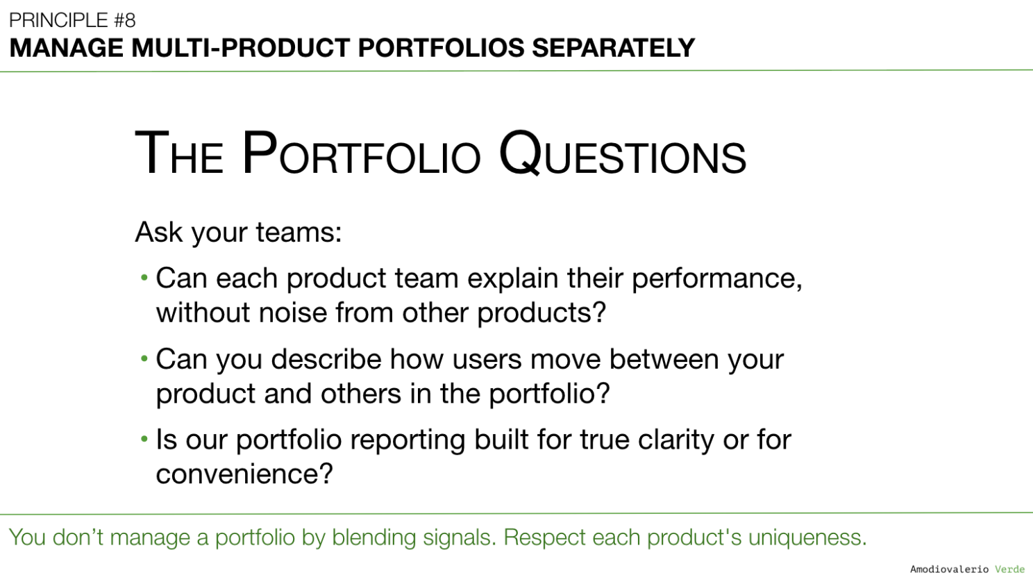
The Portfolio Questions
To test whether your portfolio reporting is driving clarity instead of camouflage, ask your teams three hard questions:
- Can each product team explain their performance without noise from other products? If not, you’re already in Franken-metric territory.
- Can you describe how users move between your product and others in the portfolio? Understanding these flows is critical to seeing where adoption lifts or stalls across the suite.
- Is our portfolio reporting built for true clarity or for convenience? Dashboards that make life easier for executives but obscure the truth are liabilities, not assets.
If the answers make you uncomfortable, you’re closer to the truth than if everything “looks green.”
Final Thought
Blended metrics can feel reassuring, but they don’t always provide the clarity needed for sound judgment.
If you’re managing a portfolio, your job isn’t to show a smooth story. It’s to expose the uneven truths (the thriving, the struggling, the risky) and make decisions with eyes wide open.
AI won’t save you from this responsibility. It will only expose whether you took it seriously.
👉 This week, ask your teams:
- “Which of our products is carrying the portfolio right now?”
- “Which one is silently struggling?”
- “If we averaged less, what truths would we be forced to confront?”
Because portfolios don’t fail in one headline number. They fail in the details we choose to blend away.
What’s Next?
Now that we have a system for managing product portfolios separately, a new, insidious problem often reveals itself. Even with distinct dashboards, the entire system can collapse if teams don’t agree on what the numbers mean.
When one team defines "active user" as a monthly login and another defines it as weekly usage of a core feature, your data system isn't just misaligned; it's broken. This leads directly to our next challenge.
That brings us to Principle 9: Reconcile Metric Definitions Before Analysis. Because if your teams are arguing about the numbers, they're really arguing about the definitions.
PAQs – Potentially Asked Questions
Isn’t it inefficient to manage separate dashboards for each product?
It can feel inefficient at first glance, as though you’re duplicating effort or creating too many views. In practice, though, the opposite often proves true. Managing a portfolio without product‑specific dashboards is like driving a car without checking the fuel gauge for each tank. That said, there is no one‑size‑fits‑all. Some portfolios may need deeper granularity, others can rely on lighter layers, as long as critical risks aren’t averaged away. You may save time upfront, but risk much greater costs if a product underperforms without notice. True efficiency comes from focusing resources in the right place, not from blending everything into a single, oversimplified view. Separate dashboards make it easier for leaders to identify the right problems and address risks early.
What if leadership insists on a single “portfolio health” metric?
Executives sometimes want a single number to summarize the story. The goal isn’t to resist that request but to refine it. Instead of an aggregated Franken‑metric, create a synthesized view. Again, there is no one‑size‑fits‑all, the art is matching the level of synthesis to the complexity of your portfolio without losing sight of the underlying truths. For example: present a portfolio slide that uses a red/yellow/green status per product, backed by context. That way, leadership gets the simplicity they want without the blindness they fear later. Think of it as a health check panel, not a single heartbeat reading. Each product shows its own vital signs, with a clear overall interpretation.
How do we avoid overwhelming executives with too much detail?
Executives rarely have time for endless tables. A layered view can provide the high-level story with the option to drill down when needed. Start with a synthesis slide that tells the high-level story. Then provide drill-down capability for each product so they can zoom in when something looks off. This is the “telescope first, microscope on demand” approach. The executive conversation should start with a clear narrative, then allow curious or skeptical leaders to explore detail where it matters. Overwhelm happens only when we throw detail without context. Layered dashboards prevent that.
My team says we don’t have time for per-product reviews. Thoughts?
It can feel like there isn’t time for per-product reviews, but the long-term cost of skipping them is usually higher. It’s a bit like ignoring the oil light in your car because you’re late to a meeting: you may get away with it a few times, but eventually it creates a much larger issue. Even a short monthly check-in per product can surface problems before they become serious. Product health reviews don’t need to be exhaustive. Even a focused 15-20 minute discussion per product each month can surface issues before they become crises. The cost of prevention is always lower than the cost of recovery.
Can’t AI solve this blending problem automatically?
AI is a powerful multiplier, but it multiplies what you feed it. If you give it blended averages, it will deliver precise-looking predictions built on flawed foundations. AI can be powerful, but it depends entirely on how the problem is framed. If given blended averages, it may produce precise predictions built on incomplete foundations. Used intentionally, though, AI can highlight anomalies, cluster issues, and model scenarios that bring more clarity to the portfolio.
How do I handle products that share infrastructure and overlap in usage?
Shared infrastructure and overlapping usage are common in large SaaS portfolios, but they don’t justify blended reporting. Instead, make the overlap explicit. For example: show adoption metrics separately, with a clear note that 30% of users also appear in Product X. That way, leadership can see the true contribution of each product while understanding the dependencies. Transparency matters more than tidiness. Treating two interwoven products as “one” may feel simpler in the short term but can create risks in the long run. Transparency about overlap helps ensure leaders see the real contribution of each product while understanding their dependencies.
Each principle in this series builds upon the last to form a coherent system for better decision-making. Here is the full list of principles we are exploring:
Intro: Beyond the Dashboard Series
Principle 1: Avoid the Data Delusion
Principle 2: Adopt a Data-Informed Approach
Principle 3: Choose What to Measure
Principle 4: Use Frameworks as Filters, Not Blueprints
Principle 5: Focus on Adoption, Not Just Delivery
Principle 6: Know Your Tool Stack’s Boundaries
Principle 7: Build Layered Dashboards to Scale Thinking
Principle 8: Manage Multi-Product Portfolios Separately
Principle 9: Reconcile Metric Definitions Before Analysis
Principle 10: Build Thinking Systems, Not Reporting Systems
Principle 11: Turn AI into a Judgment Multiplier